Big Tech Has Been Trying to Steal My Job for Decades. So What?
I test drove an AI tool to see if it could replace the interface-design skills I teach in my courses. What I found should resonate with instructors in every discipline.
Like many instructors, I’m faced with big questions about the impact of AI on how I teach and assess learning. These questions include:
Should I still require students to create something from scratch? If so, why? And how do I convince students there is value in this “old-school” process?
Should I let students take every shortcut available? If so, how can I raise my expectations and adjust my rubrics to focus on the skills AI can’t replace (yet)?
How do I reassure my students that there’s still a need for the skills I’ve spent decades mastering? And how do I prepare them for a rapidly changing job market when I feel overwhelmed by these changes myself?
As part of my effort to answer these questions, I’ve been testing AI tools that my User-Interface Design students might use to generate website and app prototypes. In the courses I teach, students typically use a tool called Figma to design interface mockups. Figma is one of the most popular interface-design tools on the market, and it supports variety of new AI plugins and features. I haven’t had a chance to test many of those yet, but I recently came across a tool called Uizard, which bills itself as a simpler alternative to Figma with a “lower learning curve.” It offers a free version with a limited number of projects, so I decided to give it a test drive.
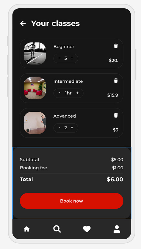
I started by entering the prompt, "Create a gym app to book pickleball classes in the style of Airbnb" and clicked the visual-style preferences for "dark," "young," and "modern." In seconds, Uizard generated an interactive prototype with a shareable link.
You can view the interactive prototype here and browse screenshots below.


What Worked Well
✔ Shapes and text layers are fully editable. (This was a stark contrast from another tool I tried, which only generated non-editable PNG files.)
✔ Icons are rendered as vectors, which means they can be scaled to any size without a loss of resolution.
✔ Specific interface elements are linked in a (relatively) logical way, making the prototype functional right out of the gate.
✔ Spacing, alignment, visual hierarchy, and "scannability" are solid overall. This is a major challenge for my 100-level students as they work on their attention to detail. (It’s easy for inconsistencies to pop up, especially as a project grows.)
What Needs Improvement
✖ Parts of the navigation flow don't make sense. For example: clicking "book class" takes me to a screen with my stats and a leaderboard.
✖ Longer button text spills out of the shapes surrounding it.
✖ A decorative image on the homepage had garbled text. This is a common issue with the last generation of AI image generators. (They struggle to render readable text.) However, this has improved significantly in recent months, so there are plenty of workarounds if a student takes the time to use a separate tool to generate these images.
✖ The design feels flat and generic overall and could benefit from some experimentation with texture, depth, and color.
Impact on Assignment Design
On the one hand, I empathize with instructors who are weary of incorporating AI into their assignments. There’s an understandable sense of existential dread. Do I stand firm and fight to pass down my values to the next generation? Or do I give in on these shortcuts I feel pressured to accept?
I get why these feel like our only options at times, but there are plenty of shades of gray to be explored. Personally, I’m not convinced that AI will kill creativity and critical thinking, and I plan to encourage my students to explore the good, the bad, and the ugly that generative AI tools have to offer. If I find that AI lets them automate tedious tasks or do certain things faster than they could before, I have plenty of ideas for new learning objectives and assignments that would’ve been too ambitious in the past.
Incorporating these new ideas into my teaching can be a painful process at times. It’s time consuming and risky. It requires that I be willing to let go of certain traditions and practices that might’ve served me well but no longer serve my students. Fortunately, I’ve found the more transparent I am with students about this process of adaptation, the richer our conversations are and the more they reciprocate with transparency in return.
Many students have shared concerns about how AI will impact their careers, and I try to reassure them as best I can. After all, big tech has been trying to steal my job for decades and yet, here I am: adaptable, skeptical, and gainfully employed.

